
The Halo Effect
Posted: November 15, 2013 Filed under: Ethics, Visual Design, Web Design | Tags: business, cognitive psychology, customer, design, devil effect, gestalt, halo effect Leave a comment If you’ve ever chosen a product based on its packaging, taken an instant liking to a person because he/she was tall & good-looking, or defended the merits of your hometown against all others, you’ve experienced the Halo Effect.
According to Wikipedia, the halo effect (or “halo error”) is “a cognitive bias in which one’s judgments of a person’s character can be influenced by one’s overall impression of him or her.” Some speculate that it grew from our most primitive ancestors: a tall, good-looking person was well-fed, had won (or avoided) battles, and seemed to be a good candidate for fathering one’s children.
Around here, we’ve been looking at our current and future needs and trying to figure out which products will help us achieve what we want. Some of us take an instant dislike to a product because of a seemingly-trivial factor. It could be color, the salesperson, or almost anything that triggers a negative memory about a previous product. That’s called the “Devil Effect,” by the way: we demonize something because of deep-seated and inexplicable feelings. Imagine the consequences of the devil effect in a jury trial!
If you think about it, the halo effect is just as treacherous. We might overlook a product’s failings because we like the color, the salesperson…you get the idea. The halo effect makes it tough to be impartial.
While we can’t do much about our cognitive wiring, knowing about the halo effect can help us be more aware of the potential for bias. It can even make us more aware of how we present professional writing: even if my message is rock-solid, if I don’t present it cleanly, the reader might not receive it favorably.
That’s why we care about good page or screen design, sometimes even more than the content. There are cognitive reasons to pay attention to alignment, balance, contrast, consistency–what some of us refer to as the CRAP design principles.
Finally, the experts at Nielsen Norman Group applied the halo effect to web usability testing, and the results are interesting to say the least. Take a look at Alertbox: The Halo Effect and see for yourself.
Photo Credit: bossa67 via Compfight cc
10 great resources for infographics and visuals
Posted: November 6, 2013 Filed under: Correspondence, Visual Design, Web Design | Tags: design, images, infographics, visuals Leave a comment Don’t you love a good infographic? According to Wikipedia, infographics are graphic visual representations of information, data or knowledge intended to present complex information quickly and clearly. My favorite part is in that last prepositional phrase: to present complex information quickly and clearly. Yeah!
Infographics aren’t new; they have been around at least since the days of lithography. The famous infographic at top left is Charles Minard’s 1869 chart showing the number of men in Napoleon’s 1812 Russian campaign army, their movements, as well as the temperature they encountered on the return path.
An infographic can be created in almost any software that offers good support for visuals: Adobe InDesign, Photoshop and Illustrator, PowerPoint, even Word. Infographics can be poster-sized or notebook-sized. It’s all up to the designer.
Infographics sure are great. But here’s the rub. Not all of us are visual designers–I count myself among the aesthetically challenged.What to do?
Fortunately, there are some great resources for designing infographics and images. Best of all, you might discover that someone else has created the perfect infographic, and with proper attribution, you can borrow it for your own purposes.
In no particular order of favoritism, here are 10 of my go-to sites:
10. Cool Infographics: Randy Krum’s blog highlights some of the best examples of data visualizations and infographics found in magazines, newspapers and on the Internet. This site can inspire you to greater heights in your own visuals.
9. Daily Infographic: According to the founders, “We spend countless hours searching the web for the most interesting, stimulating, mind-blowing infographics. We then curate our findings and choose one infographic to publish every week-day.” It’s true! Much like Cool Infographics, you can gather inspiration or find the perfect infographic for your presentation. Bonus: subscribe to receive a daily infographic in your inbox or feed reader.
8. Infogr.am: Not to be confused with Instagram, this site allows you to build infographics and charts from templates. Like most free sites, your options are pretty basic. If you upgrade to pro, you get a few extra perks. But for a quick infographic for school or a business presentation, this site will do the trick.
7. MorgueFile: When you need some free high-resolution stock photographs for your infographic, MorgueFile might be just the ticket. Don’t let the name scare you: in newspaper terminology, a morgue file is a place to keep post production materials for use of reference, an inactive job file. This is one morgue you’ll enjoy visiting!
6. IconsPedia: This site is great for when you need some stick figures, social media icons, or other themed icons for your infographic.
5. Piktochart: A drag-and-drop infographic editor, with several good-looking free templates. One caution: that nice functionality means that the site uses lots of Flash. The paid versions might be worth checking out if you plan to create infographics for your company or school on a regular basis.
4. Wylio: Wylio functions much like a Google image search (it’s not, but you can use your Google login to get up and running quickly). The free version of Wylio allows you to download 5 free images a month. Wylio is a “bootstrapping startup”, so you never know what you’ll find.
3. Mashable Infographics: Need to convince your company to launch a social media campaign? Mashable’s infographics cover every aspect of technology and social media. You’re sure to find something interesting here.
2. CompFight: CompFight searches Flickr Creative Commons images and produces some great hi-res images. You can filter by license, and best of all, they provide the HTML that will allow you to credit your source.
1. Visual.ly: Lots of cool infographics to pin, embed, or favorite. Visual.ly also bills itself as the marketplace for infographic designers and customers; you can find each other here.
Bonus: Easel.ly, another do-it-yourself infographic builder, is one I just discovered. It allows you to apply a theme (timeline, maps, etc.) and add objects. Seems like a really user-friendly site!
There you go! Get working on your awesome infographic. And add your favorites in the comments!
The dreaded team project
Posted: October 17, 2013 Filed under: Collaboration | Tags: collaboration, interpersonal communication, planning, project management, projects, team, technology, writing Leave a comment The team project is every student’s worst nightmare. The grim acceptance of yet another doomed academic exercise seems to be an unavoidable part of higher education. Yet, as I tell my students, you will work on some kind of team project in virtually all modern workplaces. With a little bit of planning, you can–and will–survive.
First, let’s define a project. It is
The key to survival is focusing on that first bullet point. A project is temporary. Hang on to that hopeful thought.
It’s also comforting to know that conflict is a natural part of teamwork. Almost 50 years ago, Bruce Tuckman identified his famous team stages: forming, storming, norming, and performing. If you are “storming” within your team project, you can remember that your project is following the Tuckman progression just as it should. (Of course, the problem is that some teams never get past the storming stage. More on that in a bit.)
Meredith Belbin (1981) looked at team projects through a behavioral lens. He noticed that different individuals in a team displayed distinct “team roles” to varying degrees. A healthy team features a fairly balanced distribution of the roles:
- Coordinator (Chairperson): sets agenda, tracks, coordinates
- Resource Investigator: finds new info, new ideas
- Team Worker: looks for his/her part, gets work done
- Shaper: focuses on action tasks, completing project
- Implementor (Company worker): turns plans into actions
- Completer/Finisher: detail-oriented, schedule-aware
- Monitor/Evaluator: IDs flaws, focuses on outcomes
- Plant: creative, focuses on big picture
- Specialist: adds depth, masters a specific topic/area
Knowing that people exhibit their unique set of dominant team behaviors (Plants versus Completers?) helps us understand why we have conflict. Teams truly do have a personality, a mix of traits and behaviors.
The ultimate secret to project success is communication. This involves planning the project (brainstorming, asking questions), establishing a common vision (sharing ideas, setting goals, understanding scope) and time management.
Time management is probably the aspect that causes the most pain. Attending (or efficiently running) the team meetings, meeting deadlines, and completing tasks in a timely manner all contribute to the success of a team project.
Team project tips and coping skills
If you’re about to embark on a team project, here are a few helpful suggestions based on personal experience and Study Skills: Team Work Skills for Group Projects, an article written by students for students.
1. Begin by describing your project. As a group, write a few sentences to establish the exact deliverable (report, poster, PowerPoint, etc.) and what it should cover. Get everyone on the same page, so to speak. It also helps to define what types of work you will need to do to complete the deliverable: research, writing, surveying, gathering stats…
2. Create a project plan. At minimum, a project plan should define the responsibilities of the team members, establish a schedule, and map out conflict resolution.
- Share email addresses, phone numbers, and any other contact information that could be useful.
- Decide how quickly team members should respond to project communications: within one day is reasonable.
- Sit down with calendars and mark off the days that will and won’t work for team meetings. Mark the deadlines of any deliverables, including intermediate steps (drafts, progress reports). Anticipate holidays, birthdays, and the inevitable demands of other classes’ projects. (And be sure to build in time for editing and proofreading!)
- Hope for the best but plan for the worst. If one team member drops the class/gets sick/stops caring about grades, what will you do? Figure this out on Day One. Avoid some of the “storming” and put your team on the path to “norming”.
3. Divide & conquer–or not? Most team projects take a piecemeal approach: you do the introduction, I’ll do the bibliography, he’ll do the graphics. There’s nothing wrong with the divide and conquer approach–it can be a very efficient way to work. Well, that is unless it’s the last hour before the project is due and you are the person who ends up assembling and editing all those inconsistent, unrelated, or missing pieces.
To reduce frustration, be sure to also build in time for the group to simultaneously work on the project. In this approach, all of you assess your progress, assemble the pieces each person has completed, and identify what still needs to be done. This is an iterative process, depending on how much time you have to devote to the project.
4. Take advantage of collaboration technologies. If you have never used Google Drive for collaboration, get yourself to Google now and start learning! Google Drive is free cloud storage for all kinds of formats: Docs, Spreadsheets, Presentations, Forms, and more. It can be a bare bones substitute for Microsoft Office, and best of all it allows you to share, track versions, and see who added that hideous purple text on page 4. Google also offers video and text chat (IM), so you can work together even when you’re apart.
Other technologies include Dropbox (free shareable cloud storage for files), Doodle (a simple calendaring app that lets you schedule meetings at convenient times) and a whole bunch of others. You can even build a free website on Weebly or Wix or (hey!) WordPress.
If you need a high-powered (costly) solution, look for 30 day trials or academic versions. And don’t forget to check out your school’s site-licensed software. You might be pleasantly surprised at what is available.
Conclusion
Stay positive and stay flexible–you will get through this. Look at it as a chance to build your management skills and snag a good story for a job interview (“tell me about a time you had to solve a problem.”) And if all else fails, seek motivation.
Aristotle wants you to ace your job interview
Posted: September 25, 2013 Filed under: Business, Career, Ethics | Tags: Aristotle, career, persuasion, rhetoric Leave a comment Most of us learn about Aristotle’s rhetorical triangle in high school and again in freshman English. The concept is simply this: in order to persuade your listener or reader to do what you want, your argument should be informed by ethos (credibility), logos (fact, logic) and pathos (emotional appeal). In case you were wondering, that rhetorical triangle sure comes in handy outside of school, too. Here’s a YouTube video that applies the rhetorical triangle to images from advertising.
So how does the rhetorical triangle fit in to your job interview?
- Each of the three rhetorical strategies can be accomplished through metaphor or storytelling
- Success depends upon your delivery and the audience’s reaction
Telling the story via the CAR method
The CAR formula (also known as STAR) is borrowed from many, many other people. And it works beautifully for an interview situation.
To answer most interview questions, you need to tell a story. To structure your story, use CAR:
- Context
- Actions Taken
- Results.
To illustrate, let’s pretend that the interviewer has just asked The Little Engine That Could (LETC) to describe a situation when he (it?) was challenged. The LETC begins with context: A train full of toys and candy needed to be pulled over the mountain to the children of the neighboring town. None of the big engines in the rail yard wanted to take on the task of pulling the heavy train up the mountain. I knew that the children would be sad if they didn’t get their toys and treats.
Then the LETC describes the action: I didn’t want the children to be disappointed, so I volunteered to pull all the cars of the the train myself, even though I am only a Little Engine. I went very slowly, but I kept going. All the way, I said to myself, “I think I can, I think I can.”
And then, the results: I made it over the mountain, and I said, “I thought I could, I thought I could!” I delivered the goodies to the children. They were so happy! And now I am well known for my determination.
There you have it–a way to plan for both the common interview questions and the ones that come out of left field.
The audience reaction
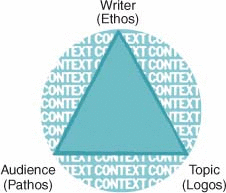
Aristotle believed that rhetoric was effective only if the audience was moved to take action. And what moved them? A credible speaker (ethos), backed up by solid facts (logos) and an appeal to what we value in our hearts (pathos). In the triangle illustration at right, we can see movement from the writer (or speaker) to the audience.
The triangle encompasses trustworthiness, passion, and any number of character traits.
- You build credibility through your appearance (classic, tailored clothing), your actions (greeting each person cordially, arriving on time or just a bit early), and your words. (My advice? Take time to plan what you want to say before you speak!).
- The facts you emphasize should be sprinkled throughout your résumé. Bring work samples and references to further support these facts.
- Research the company and the field, particularly if you are just starting out, and understand what they value. Understand who the competitors are, what problems this particular industry faces, and identify ways to align your skills to help them reach their goals.
What do you think? Please leave a comment!
Proofreading on a budget
Posted: September 18, 2013 Filed under: Business, Career, Correspondence, Language and tone, Style, Technology | Tags: business, editing, proofreading, readability, spell-check, workplace, writing Leave a comment I like to think I’m a pretty good proofreader. Assuming I can clearly see the screen or printout–which is more of a challenge as I’ve gotten older–I often find the mistakes that others gloss over. (See the billboard at left; I think I would have caught that one.)
But even with perfect vision, most of us can’t proof our own writing very well. It’s incredibly easy to overlook mistakes if you’re “too close” to the writing. And if you are a good writer, you should get close to your writing!
(Case in point: according to the company responsible for the billboard, the sign passed muster with no less than four other readers. I guess they were having an off day.)
Assuming you have the time and resources to work with a proofreader, that’s your path to error-free writing. Professional proofreaders are worth their weight in gold.
But what’s a conscientious but cash-poor writer to do? Here are some tricks I’ve collected over the years. Some might work better for copy-editing than for proofreading, but hey, it’s all iterative when it comes to writing.
- Turn on the hidden formatting characters of your word processor. These characters show things like paragraph breaks and spaces. You may find them annoying onscreen, but they won’t print on paper or PDF–try it and see. They are there only to help you find those extra spaces or mismatched font sizes.
- Manually double-check the spelling of all proper nouns: people, places and things. Spell-Check tools can learn new words, but sometimes my writing contains words that aren’t in its dictionary yet. If you’re writing something important, such as a job application letter, you’d better know how to spell the employer’s name. If your résumé boasts of your mad PowerPoint expertise, don’t spell it as power point.
- Run readability tests to tone up your copy. I cringe at the idea of a standard algorithm that rewards word or syllable count–completely antithetical to concise business or technical communication. But if you are looking for some independent verification of the complexity of your writing–and you understand the limitations–a readability test can be useful. An interesting one is The Writer’s Diet. It tells you whether your writing is “flabby or fit” in relation to vocabulary, sentence structure, and more. If you’re interested in the old Flesch or Gunning Fog-type tests, try Joe’s Web Tools or Juicy Studio for starters.
- Print your paper & read it one line at a time. Time-consuming? You bet. But sometimes the old ways are the best ways. Taking the time to carefully read your writing can help uncover typos and even problems with tone.
- Read your paper aloud, one line at a time. Why this works I don’t know, but reading my writing aloud always brings problems to the surface.
- Run your paper through an assistive technology product. This one may sound unusual, but don’t knock it until you try it. Assuming you don’t already use assistive technology, check out the built-in screen readers that exist in Word, Acrobat, Apple OS and other products. When my eyes (or brain) tire, I sometimes turn these on. The computerized voices don’t always give you an accurate pronunciation, but they can alert you to obvious errors by reading EXACTLY what is onscreen. In fact, any way to shake up the standard view of your screen can be useful. Browser extensions on Chrome & Firefox provide not only screen readers, but also the ability to switch to reverse type (black background and white text).
- Run Spell-Check any time you make changes (but understand & verify its suggestions). Technology is wonderful, but Spell-Check would not have flagged that billboard’s text as an error. All of the words are standard English. On the other hand, my WordPress spell checker doesn’t like résumé or assistive, which are both in a standard English dictionary as well. Use Spell-Check, but be cautious. Understand the reason it wants to change something, and decide whether or not you agree.
Any other ideas? Please add them in the Comments below.
Infographics on my mind
Posted: August 29, 2013 Filed under: Business, Report Writing, Style, Visual Design | Tags: data, design, infographics, visual Leave a commentData journalist David McCandless believes that information design is about solving information problems. Visualizing information can help us solve these problems in a beautiful and clear way. In his TED presentation, McCandless visualized topics ranging from CO2 emissions to nutritional supplements (McCandless, 2010).
Because infographics share characteristics of business reports, they can also add a valuable visual component to the basic proposal or empirical report. Because they can be scanned quickly, they also can substitute for a traditional PowerPoint.
For example, the infographic below offers a summary of a simple Team Viewer human resources telephone survey that asked employees about their work-related technology use during vacation. Even though the graphics and colors are simple, this infographic communicates a message that surprises none of us: increasingly, we take our work with us. We can’t imagine being out of contact even for a week.

Of course, to really get at the heart of this data, it would help to have a break-down of age, gender, industry, and other demographics. We’d need to know more about the intentions behind this survey, and perhaps more about Team Viewer’s motivation and ethos (their product is used for remote desktop sessions). But if we just need a quick bit of data to help us understand this workforce issue on a basic level, the infographic might do the trick. The data are clear and usable.
Finally, it’s hard to talk about data visualization without marveling at the work of Hans Rosling, whose television documentary The Joy of Stats, used augmented reality animation to dynamically present data. In this video, he compares life expectancy and income across “200 countries over 200 years using 120,000 numbers – in just four minutes” (Rosling, 2010). The movement and size of the data dances up and down as the timeline is punctuated by wars, plagues, and economic dips.
Like David McCandless, Rosling believes that having the data is not enough. It must be visually communicated. Rosling’s animation tells the story of the world in all of its triumphs and trials. It’s heartbreaking to watch so-called Third World countries languish near the bottom for the entire 200 years. But it’s also reassuring to see that over the past 60 years, many countries caught up with the prosperity and health of Western countries. Hopeful news, brought to you by the power of stats.
Flippin (2013). 2013 Work/life balance of Americans. Visual.ly. http://visual.ly/2013-worklife-balance-americans
McCandless, David (2010). The beauty of data visualization. TED Talks. http://www.ted.com/talks/david_mccandless_the_beauty_of_data_visualization.html
Rosling, Hans (2010). Hans Rosling’s 200 countries, 200 years, 4 minutes – Joy of Stats. BBC. http://youtu.be/jbkSRLYSojo
Inspiration vs. Perspiration
Posted: August 13, 2013 Filed under: Business, Style | Tags: editing, writing Leave a comment

There’s no doubt about it: even though I work as a technical writer and teach a technical writing class, I don’t find writing easy.
We’ve just finished a long slog through summer courses here, and now we’ve got less than two weeks until fall semester starts. There’s lots to do, and not much time to do it.
Today, I don’t even think that blogging is easy. So I’m copping out by letting someone else, the very talented Daphne Gray-Grant, dispel the notions of inspiration and God-given talent.
9 things to give up to become a better writer | Publication Coach.
Typography and Web 2.0
Posted: July 31, 2013 Filed under: Business, Correspondence, Social Media@Work, Style | Tags: audience, business, communication, design, fonts, typography Leave a comment
A weird thing happened in 2009 when IKEA decided to change from Futura to Verdana. People noticed! And they weren’t at all happy about it.
Even if doesn’t register in a concrete “Wow, look at that cool font” kind of way, the ethos of a font family is present in thousands of intrinsic little ways: the curve of a letter, the thickness of a line, the feeling that it invokes. College Humor took that idea to a new and silly level in its personified “Font” videos: check out Font Fight.
If you still think that a font is a font is a font, allow me to explain a little more about IKEA’s situation.
IKEA had a very good business reason to switch from Futura to Verdana: their website was already using it, and they wanted their print materials to match. Verdana is a fine font for the web: it’s available on almost any computer, and it looks clean and modern. It’s even a sans-serif font, just as Futura is. But the big difference was that Futura was not a web-friendly font (ironically, that isn’t the case now.)
So let’s take a look and see what the controversy was about. Below is an image of the two fonts, courtesy of http://arts.nationalpost.com/2011/11/03/ikeas-epic-swedish-fontroversy/. Shocking differences, yes? 🙂

In a National Post excerpt of his book Just My Type: A Book About Fonts, Simon Garfield explained more about the true source of the controversy:
Like the bookcase, Verdana was also in almost every home, and becoming something you barely noticed. But that, for dissenters, was the point: Verdana was everywhere, and now it was in one more place. It was becoming a non-font that we don’t even register [emphasis added]. Which is precisely why it was so effective, and exactly why it was chosen (Garfield, 2011).
Typography really does set a mood–it almost affects the way we speak the written words. Remember when LeBron James left Cleveland to seek his fame elsewhere? Dan Gilbert, the Cavaliers’ majority owner, wrote a scathing open letter about James’ ‘shameful display of selfishness and betrayal’ (Gilbert, 2010). Very harsh words indeed.
The kicker? The letter was written in Comic Sans, one of the most reviled and ridiculed fonts on the planet.
It’s worth a short digression to read the letter in its original Comic Sans glory. Try reading it aloud without laughing. Was this font chosen in a show of disdain or in a tone-deaf move by an angry Clevelander? Or was Comic Sans one of five fonts that could be chosen in a basic web editor? You be the judge.
So this brings me to templates. Templates forsake individual control in favor of stability and consistency. As Kristin Arola explains in The Design of Web 2.0: the Rise of the Template, the Fall of Design, this separation of content and form means that the rhetorical choice behind a particular font, for example, is now taken away from us. Much like the IKEA “fontroversy”, we are now presented with “non-fonts that we don’t even register”:
In the late 1990s, creating a web page through either hand coding or a WYSIWYG program necessarily included choices of how and if to incorporate graphics, colors, fonts, sounds, and hyperlinks. Today, our students still choose photographs, words, sounds, and hyperlinks (clearly all rhetorical choices), but they choose colors, fonts, and shapes less and less. Instead, the platform, or more specifically the design template, is chosen for them (Arola, p. 6).
Like most social media sites, my WordPress template works well for me because the creators took out some of the guesswork. There is no need for me to use HTML or CSS to structure the page; the template takes care of that for me. My site will look pretty much the same on Firefox, Chrome, or Safari. It’s a good thing, right? Maybe not.
Perhaps we all need to guard ourselves and our friends from the misuse of Comic Sans (except on April Fools Day), but the very nature of Web 2.0 means that we must understand exactly what we lose: the ability to rhetorically create the space and ethos of a communication.
Come to think of it, that little bit of ethos might be worth fighting for.
Sources
Arola, Kristin L. (2010) The design of Web 2.0: the rise of the template, the fall of design. Computers and Composition 27 (2010) 4–14.
LinkedIn: more than a job-hunter’s paradise
Posted: July 3, 2013 Filed under: Correspondence Leave a comment
When it comes to LinkedIn, most of us think of it as social media beacon for job-hunters. Indeed, an infographic published by Business Insider states that almost 90% of job seekers have a profile on a social media site (“Infographic”). If you are looking for a job, clean up your Facebook and Twitter profile, build up your LinkedIn profile, and seek out more connections.
Of course, recruiters sometimes look for profiles, even when you aren’t looking for a job. Not interested, guys! But here’s some food for thought:
“Many potential recruits also use LinkedIn as a research tool. For instance, suppose a person had two good job offers. Which organization will be a better match for them? What will their new boss or colleagues be like? What is the corporate culture like? LinkedIn can help them to find out ” (“Using LinkedIn”).
Even if you are not looking for a job, LinkedIn can be useful to polish your professional image. As Liz Ryan of Business Week put it, “It showcases not only your name, photo, and professional credentials but also your colleagues’ recommendations, your brilliant thinking, and your excellent roster of connections” (“Ten Ways”).
In my case, I’ve used LinkedIn Groups to learn more about topics like higher education, knowledge management, web accessibility, and social media. I’ve read articles by people I follow, networked with women who graduated from my old high school, and I’ve featured my presentations in a way that (I hope) establishes my professional brand.
If you are just starting out on LinkedIn, there are many resources for you. Not all of them are available in LinkedIn, so if you really want to do a thorough job on your profile, I suggest first visiting these three sites:
- Slideshare: If you have ever designed and presented a PowerPoint, Slideshare is a place to upload, share, and comment on your deck. You can upload a native PPT file or a PDF. At one time, LinkedIn had a nice app to integrate content from Slideshare, but now you simply add a link in one of your profile sections, such as Experience or Education. I was confused by this, since I expected something different when LinkedIn purchased Slideshare, but it is what it is.
- Twitter: Some in the Twitterverse were disillusioned when Twitter made changes to its API. But never fear: you can share your thoughts to Twitter from LinkedIn. Like any social media site, there is a place for you to share a status, call out a friend, or attach a file. You can decide whether or not to share this status update with all of LinkedIn, only your Connections, or with LinkedIn + Twitter. That sure makes it easy to cover the professional bases when you want to publicize a conference or update colleagues on a new initiative.
- WordPress: Blogging isn’t just for bands. By setting up a professional blog in WordPress, you can set up an automatic notification that informs your LinkedIn network of new posts. Better still, add a link to your blog in your status so that you can personalize the message around the blog.
You can keep going: add about.me, your website, your online portfolio…ah, you get the idea.
Inside of LinkedIn, there are many other ways to build expertise and share ideas:
- Join an interest group. As I mentioned, I’ve joined several groups that relate to my professional interests. I’ve even joined groups for my outside interests, such as animal welfare. In some groups I’m a lurker, but in others, I like to participate by answering questions, following discussions, and “bookmarking” interesting topics. This has actually formed some of my professional development, as I’ve learned about new software and sites that I can use.But be careful: Liz Ryan cautions against inviting random people from your groups to join your network (“Ten Ways”). Take your time and get to know them a bit first. And it goes without saying that some groups can backfire when seen by a professional contact. I dropped out of the “Grammar Nazi” group because I didn’t like the sound of that group’s name. But I kept “Grammar Geeks,” at least for the time being. Better a Geek than a Nazi, I guess.
- Customize your home page. As the screen capture below illustrates, I like a lot of info on my home page. Your mileage may vary.
 There are several other notifications that can be customized: you can receive emails to alert you to various actions, or you can view your group’s activity in a weekly digest. It all depends on your comfort level.
- Follow influencers. I can’t get enough of Guy Kawasaki and Pete Cashmore, but that’s just me. To hear more from the people that interest you, hover your mouse over the word “Interests” at the top of your LinkedIn screen, and choose from scads of channels that are available to you. Then move to the next page, where you can follow individual influencers.If you don’t know who to follow, don’t worry. LinkedIn is getting to know you day by day, and it will keep suggesting people to you!
LinkedIn has something for everyone. If you were waiting for graduation to join, change your strategy and begin building your professional profile today.
Sources:
Business Insider (2011). INFOGRAPHIC: Can Facebook, Twitter And Linkedin Really Get You A Job? http://www.businessinsider.com/infographic-facebook-twitter-and-linkedin-really-get-you-a-job-2011-12
Mindtools (n.d.) Using LinkedIn Effectively. http://www.mindtools.com/pages/article/linkedin.htm
Ryan, L. (2010). Ten Ways to Use LinkedIn in Your Job Search
http://www.businessweek.com/managing/content/jun2010/ca2010067_197297.htm
The humanity of social networking technologies: phatic communication
Posted: June 23, 2013 Filed under: Ethics, Language and tone, Social Media@Work, Technology | Tags: phatic communication, social media, technology, twitter 1 Comment
The other day I was chatting with the parents of some incoming first-year students, and the topic turned to the ways technology has changed since we were in college. One dad bemoaned the increasing preference for texting over telephone conversations (not to mention face-to-face conversations.)
He went on to point out the dehumanizing effects of social media–a viewpoint that many experts agree with. In fact, heavy Facebook use has been linked with higher rates of depression and general dissatisfaction with life in college students. Yikes!
In their article On phatic technologies for creating and maintaining human relationships, Victoria Wang et al define a phatic technology as one that “serves to establish, develop and maintain human relationships.” An outcome of this relationship is the formation of a social community (44). If that dad and I had more time (and if I weren’t trying so hard to be agreeable), I might have pointed out some of the ways that texting, Twitter, Facebook, and all the other social tools have actually given us additional chances to maintain community and the human touch, especially from a distance.
Because I work in technology, I know all too well that social media has its pitfalls. And I have seen enough cat videos to last for three lifetimes. Yet social media has also enabled me to keep in touch with family on both coasts, receive urgent news instantly, and to experience a sense of community with colleagues, friends, and relatives who may never meet each other in person. (I won’t pretend to speak for traditional-aged college students, who may experience both the need to connect and the need to strike out on their own.)
Writing in Awareness Systems: Advances in Theory, Methodology and Design, Frank Vetere et al found that online phatic interactions fell into four categories:
- maintaining an existing relationship
- initiating a conversation
- developing a new relationship
- being polite and observing social norms (183).
It is this fourth category, the idea of being polite, that critics seem to focus on the most. Can it be that people understand the rules of “Twittiquette,” but they have in the meantime lost their ability to function in polite society? For example, in a humorous video treatment, YouTube user evmoneytv pokes fun at our apparent struggles with understanding how to wait in line (“How to stand in line”). We clearly need help relearning our manners.
In fact, as Frank Vetere and his co-authors point out, phatic systems are designed precisely to convey significance and meaning by taking the shortest path possible — cutting the line, if you will (178). The real differentiator for modern phatic technologies is not rejection of good manners, but an emphasis on speed. We can complete social transactions almost instantaneously, compared to some of our older methods (like letter-writing). We shorten our messages or leave out some of the details in order to keep up the pace. For some of us, the speed adds a sense of anxiety as we try to stay connected to our communities. And when we’re anxious, we can forget our manners.
Certainly we feel wistful about the joy of reading a beautifully-written letter or the thrill of hearing the voice of a loved one, but let’s not assume that new technologies completely eliminate the human touch. Remember what your mama taught you, and follow the Golden Rule–we’ll figure the rest of it out as we go along.
Sources:
evmoneytv (2010). How to stand in line. http://www.youtube.com/watch?v=9wispKpTV74
Gibbs, M. (2009). The first 10 rules of Twittiquette. http://www.networkworld.com/newsletters/200
Markopoulos, P., De Ruyter, B., Mackay, W., eds (2009). Awareness Systems : Advances in Theory, Methodology and Design. http://rave.ohiolink.edu/ebooks/ebc/9781848824775
Socialtimes.com (2013). Is Facebook Ruining Our Social Skills? [Infographic] . http://socialtimes.com/is-facebook-ruining-our-social-skills-infographic_b123556
V. Wang, J. V. Tucker, T. E. Rihll (2011). On phatic technologies for creating and maintaining human relationships, Technology in Society, Volume 33, Issues 1–2. (http://www.sciencedirect.com/science/article/pii/S0160791X11000182)
